About the project:
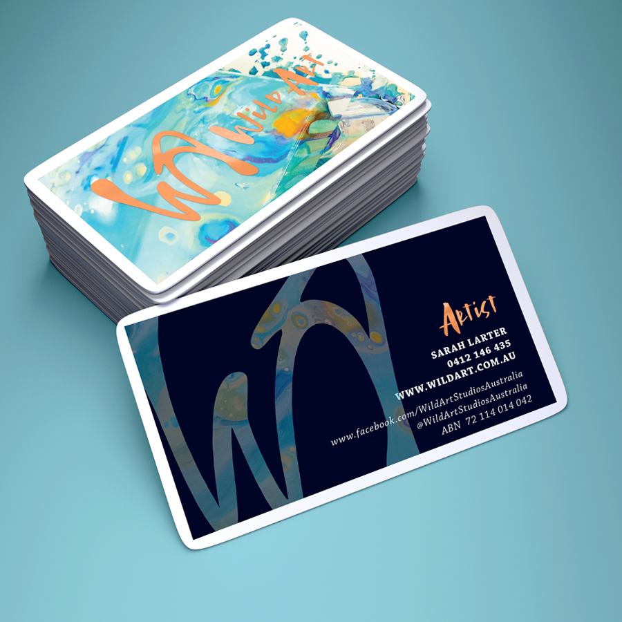
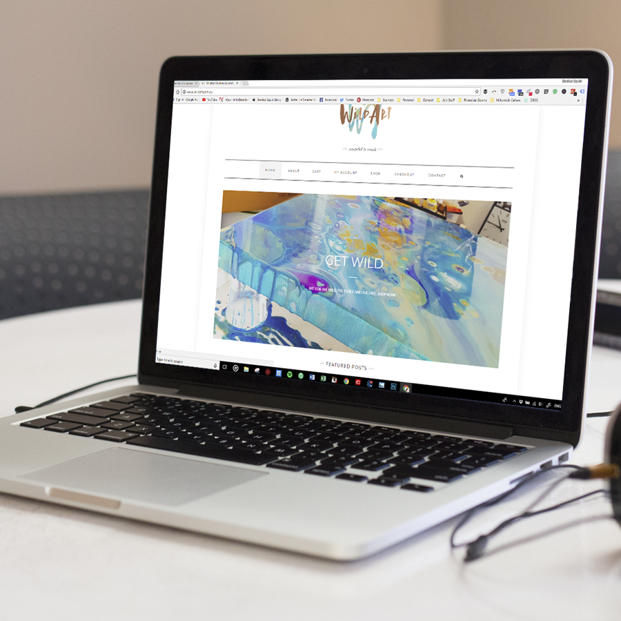
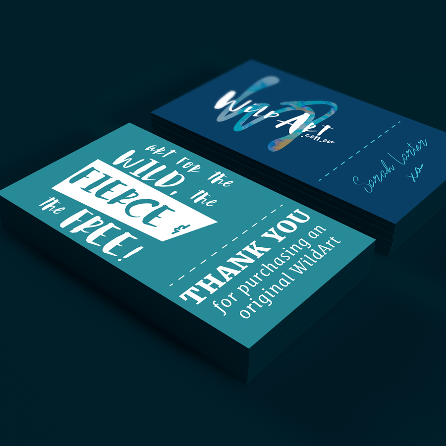
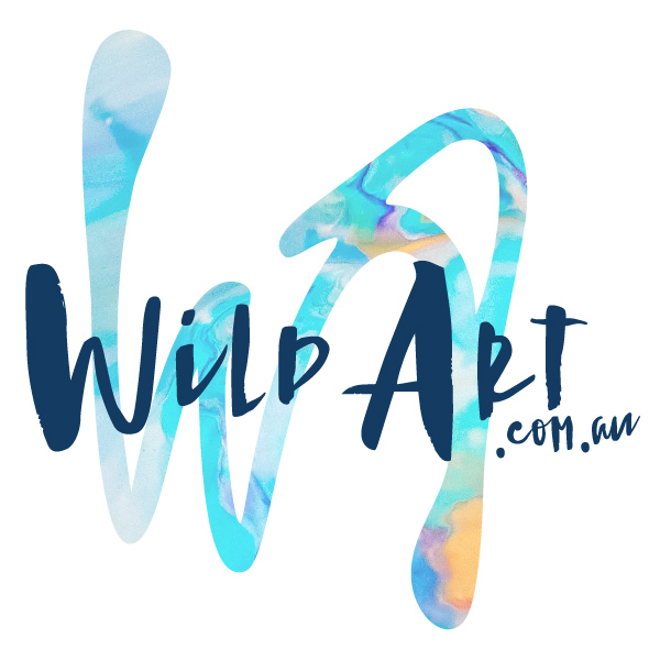
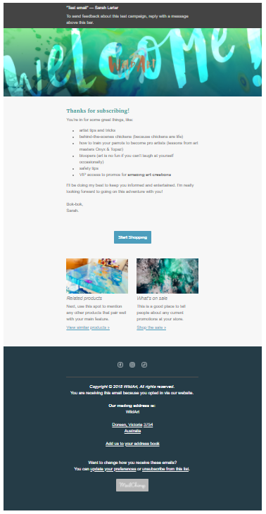
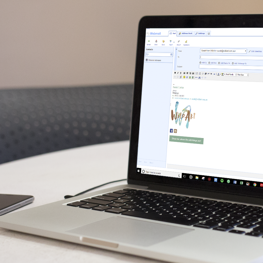
This local artist required brand development and a visual identity for their work. Key words were modern, fun, bright, friendly, and untamed. A slightly distressed brush font was chosen to represent artistic freedom. The ‘WA’ symbol conveys a freeflowing continuous motion representing the liquid medium.
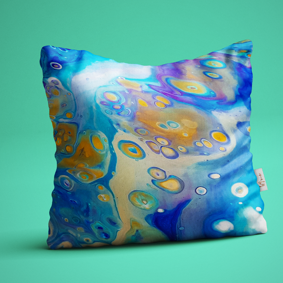
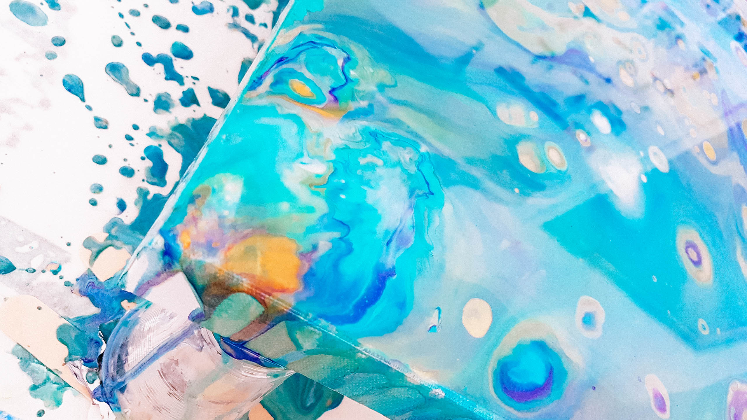
The artist’s own work, complete with ‘in-studio mess’, was used on the business cards to give the viewer a clear idea of the artwork involved, and to showcase the openness and vulnerability required in creative pursuits.
The reaction:
“Startled Squid is so professional and easy to communicate with. I felt like my project was taken to it’s full potential and I’m so happy with the results. Their knowledge is well founded and covers so much more than I realised was involved. I would highly recommend Startled Squid if you are serious about your business as they will give you ‘wow’ service.” – Sarah L., Artist

